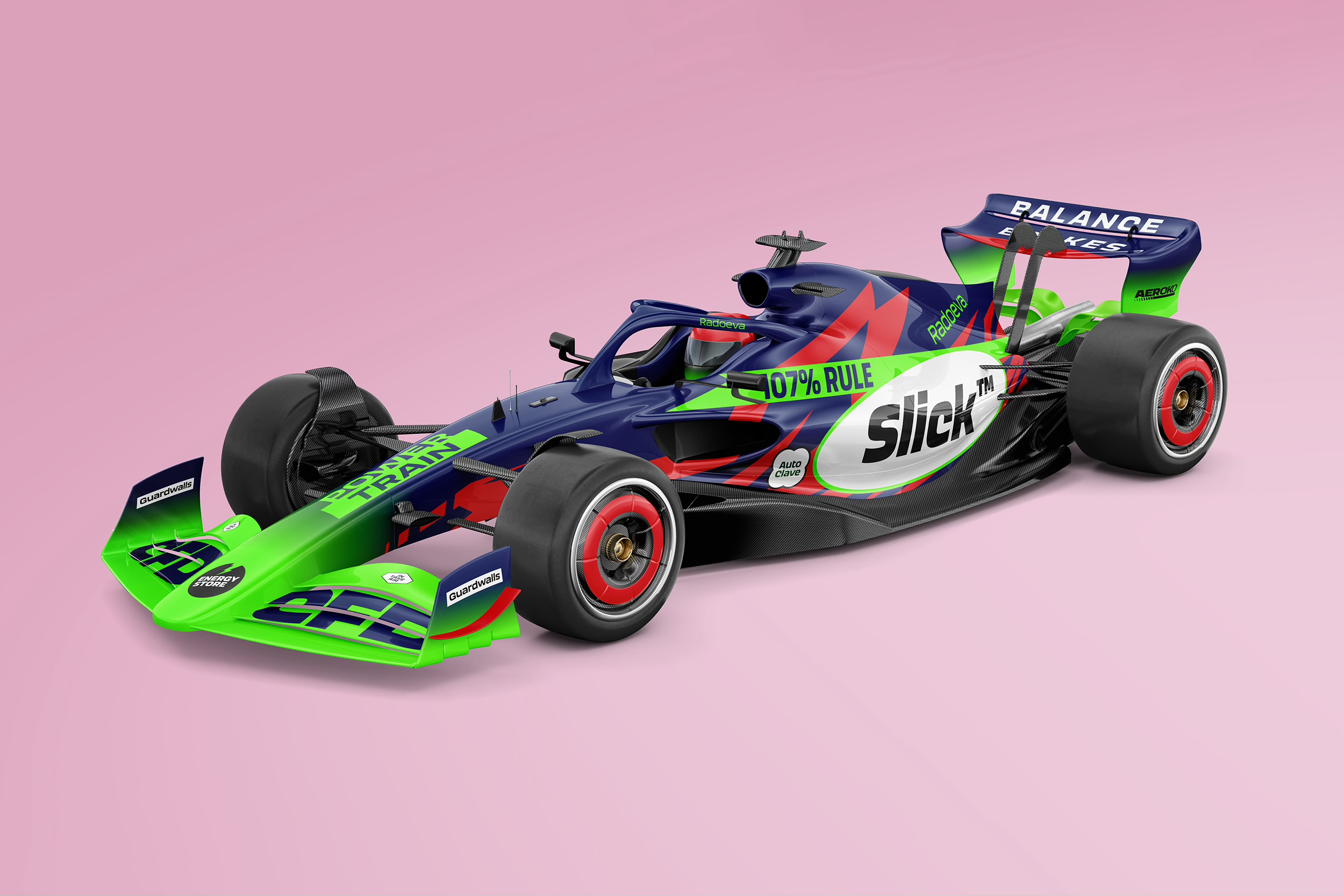
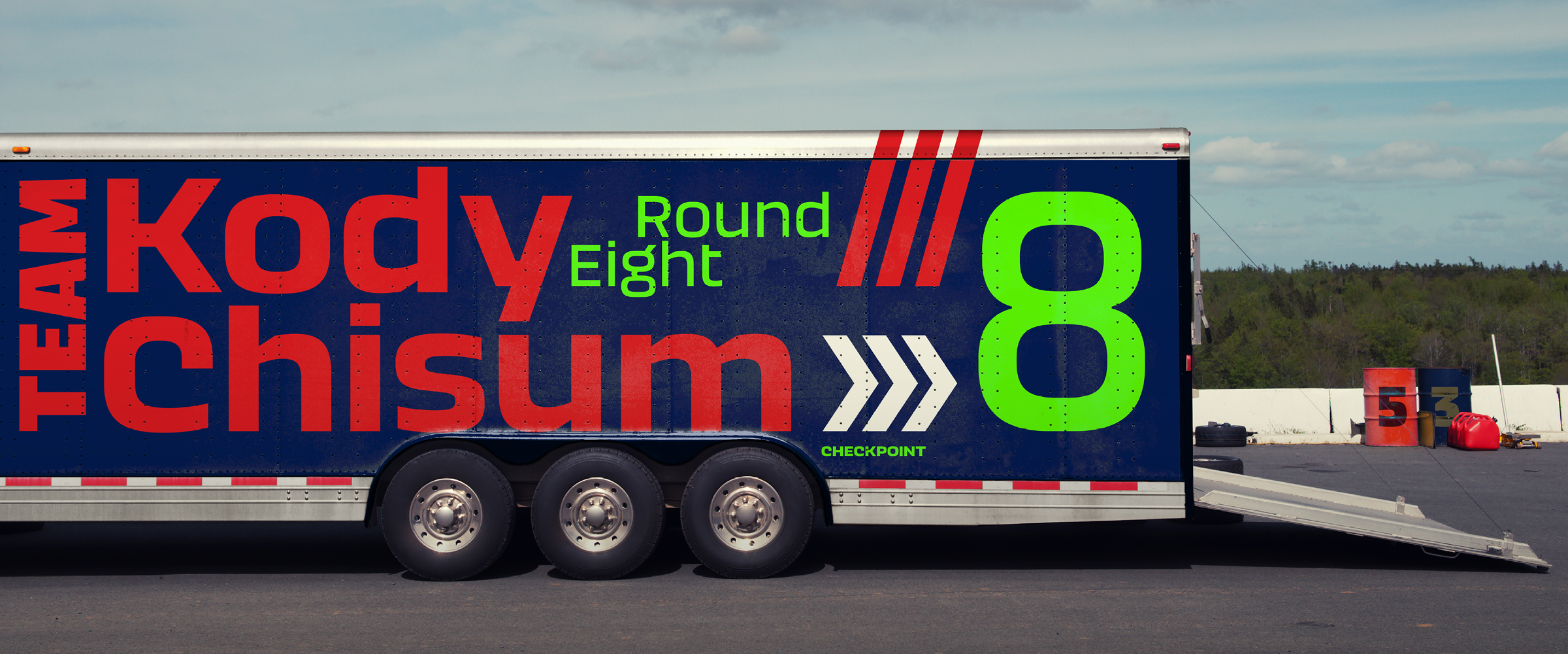
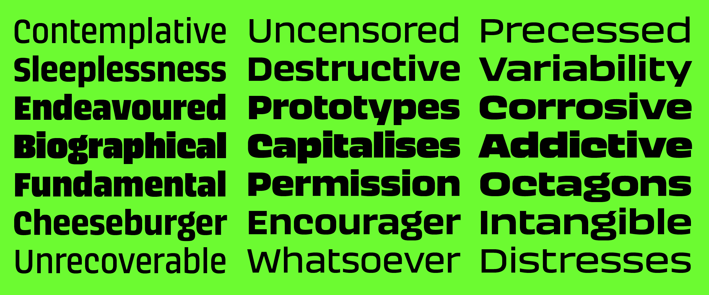
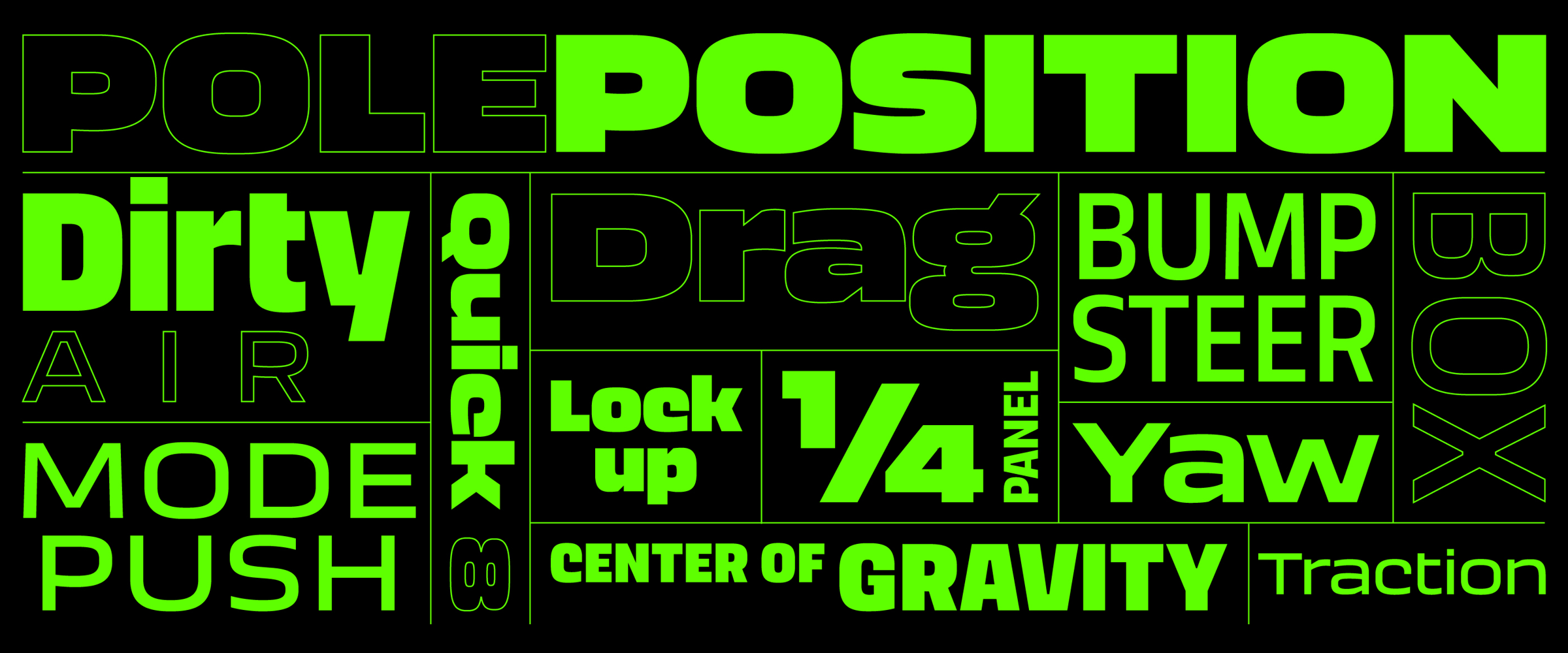
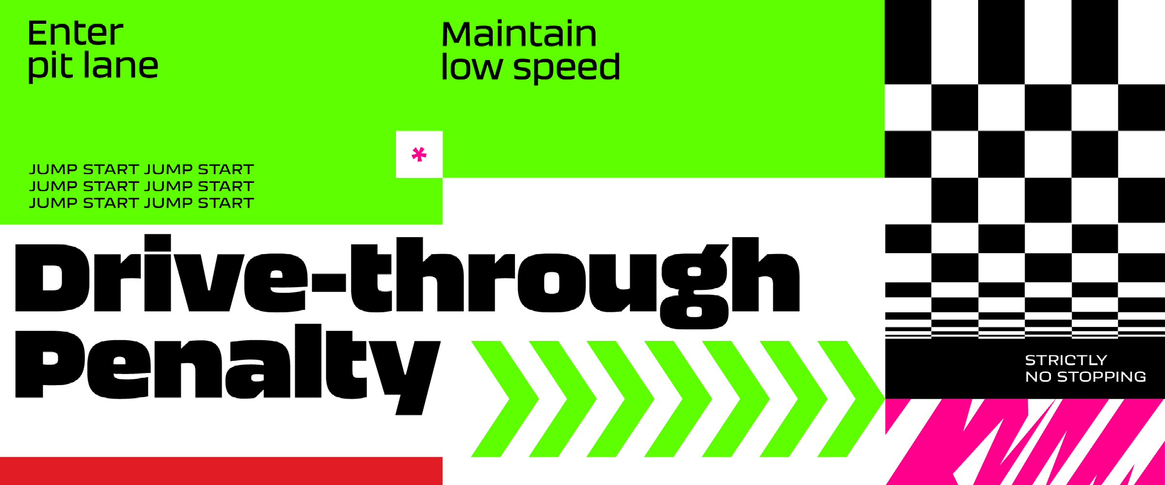
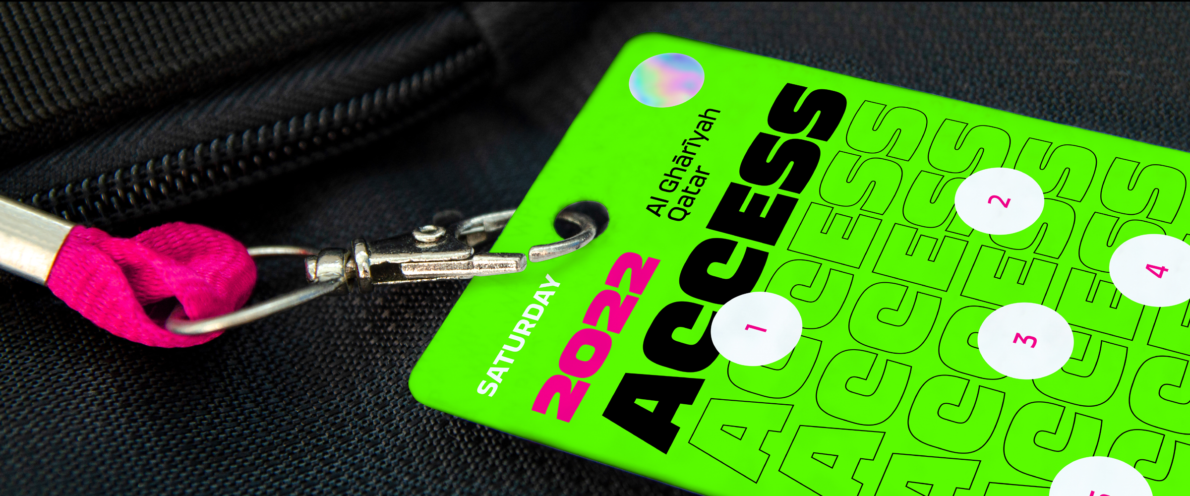
Aeroko is a robust type system in a range of weights and widths. A squarish sans, designed to express high energy, power, agility and strength.
Type Design: Krista Radoeva
Creative Direction: Phil Garnham
Foundry: Fontsmith/Monotype
Visuals: Believe In
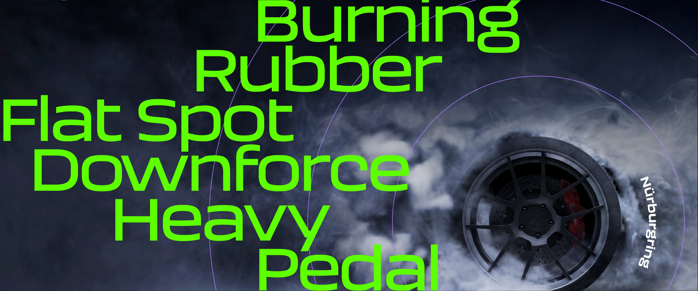
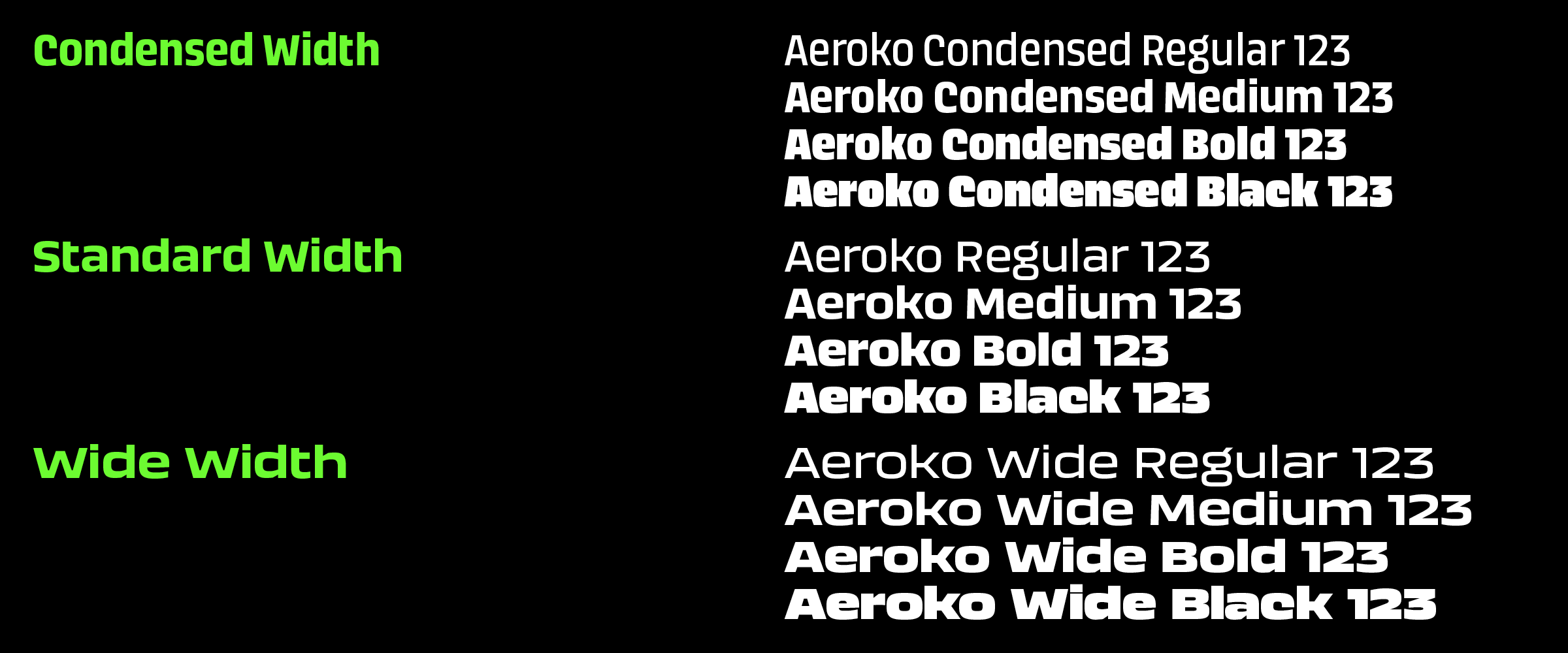
Aeroko is powerful type system in four weights and three widths, as well as a two-axes variable font. At the start of the project, I asked myself: what are the shapes that express high energy, power, agility, strength, flexibility and explored these ideas throughout the design process. Aeroko plays with the balance between squareness and roundness. It is solid and boxy, but also expressive, with a human touch. The secret to its solid look in headlines is not just the squarish space-filling shapes, but also the extreme x-height, combined with very compact ascenders and descenders. Aeroko is bold and assertive, it moves fast in headlines, it flexes when and where you need it.