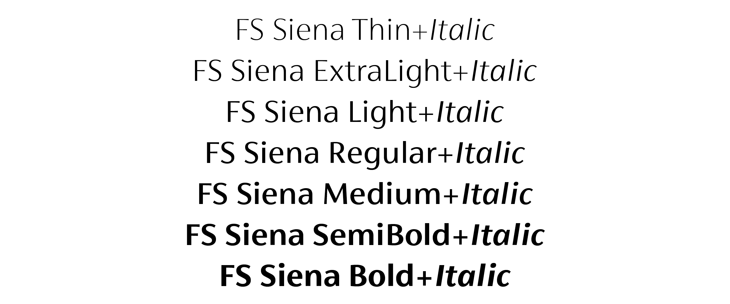
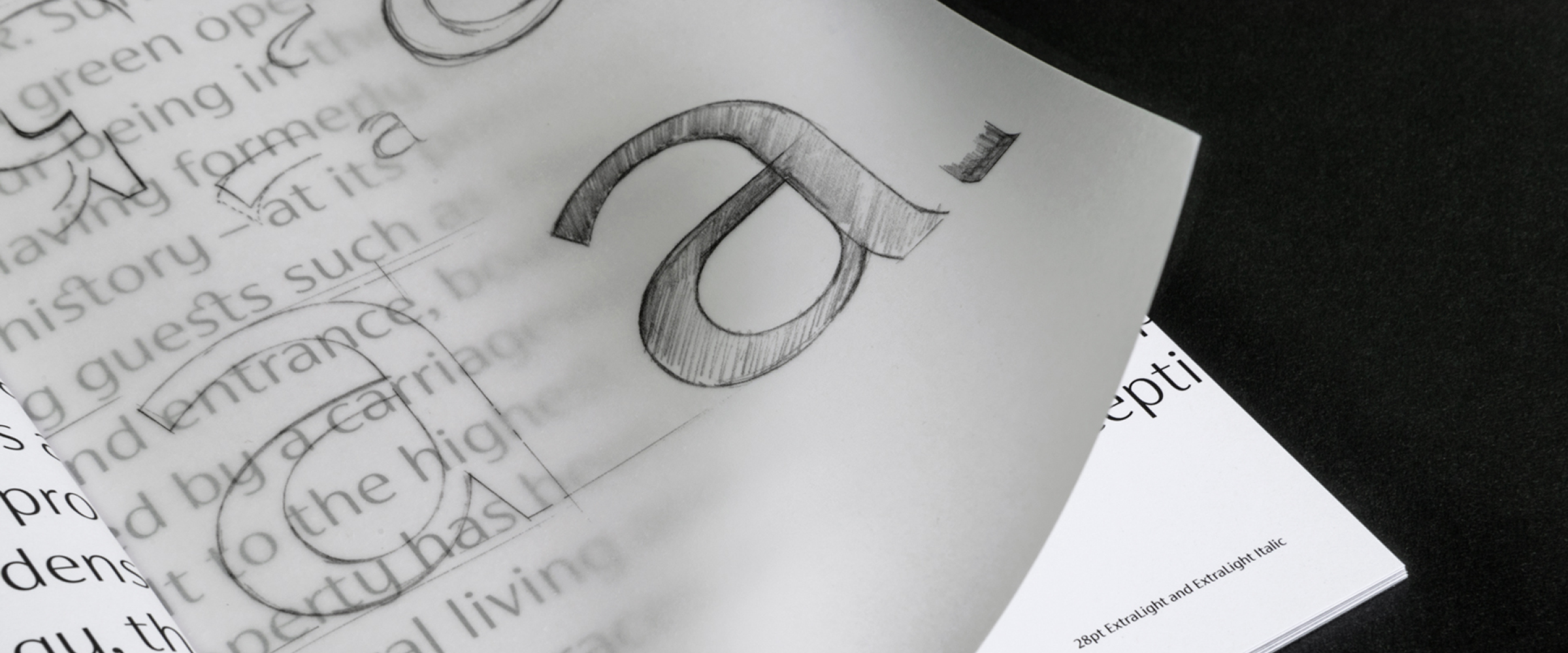
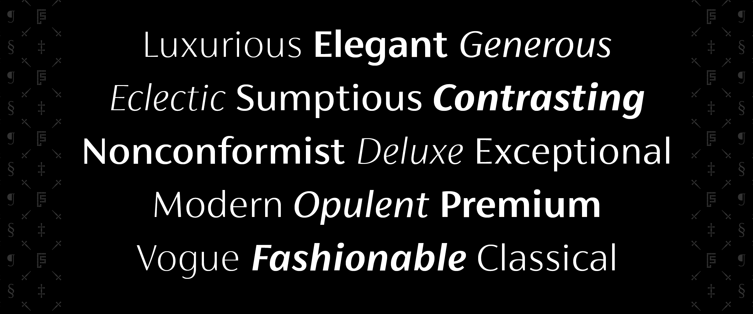
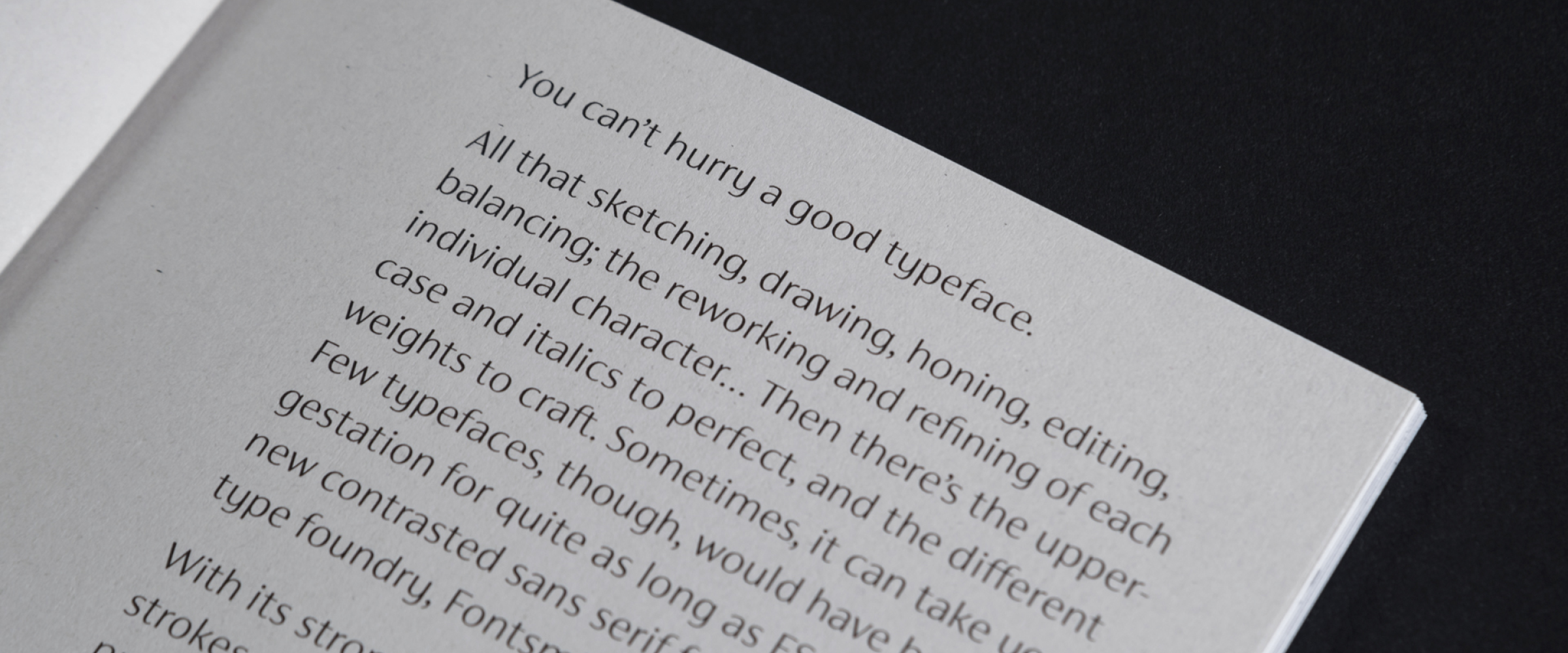
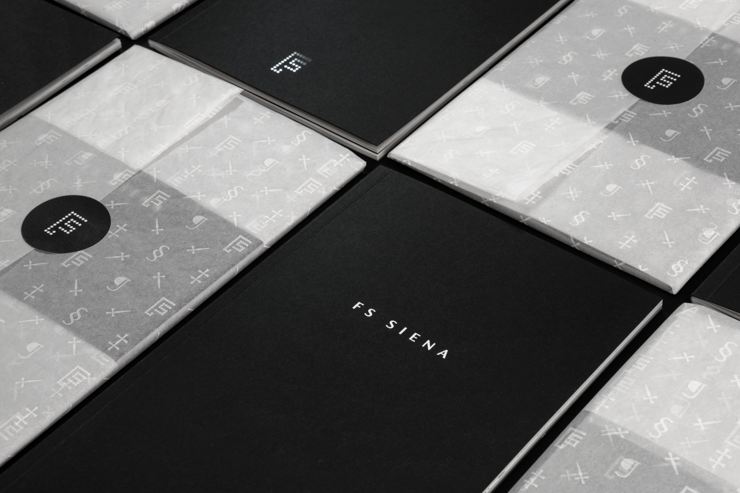
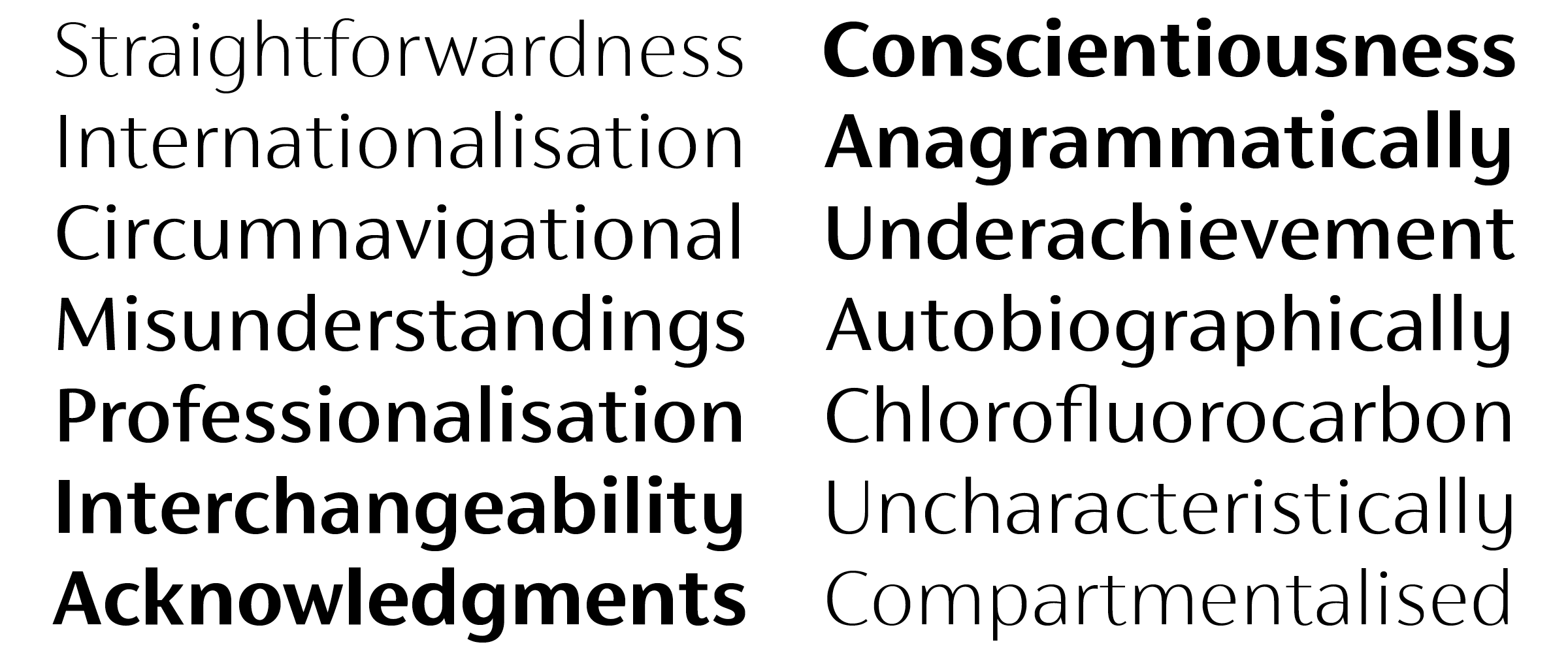
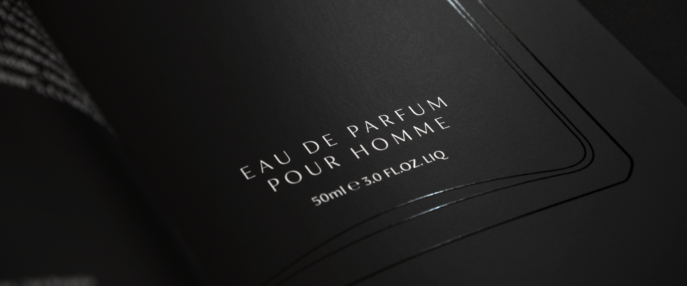
FS Siena is a contrasted sans typeface, blending classical elegance, eclectic spirit, and modern simplicity to create letterforms that evoke luxury.


Type Design: Krista Radoeva
Creative Direction: Jason Smith
Foundry: Fontsmith
Specimen: The Counter Press
FS Siena is a contrasted sans-serif typeface, blending classical elegance and modern simplicity. Its construction and proportions are descended from classical broad-nib calligraphy and humanist typefaces, with a high contrast between the thick and thin strokes. The angle of the contrast, though, is vertical, more in the character of pointed-nib calligraphy and modernist typefaces. This vertical stress helps to give FS Siena a strong, cultured presence on the page.